Olikka Security Halo
Category
Application DevelopmentCustomer
OlikkaDate
April 6, 2020Location
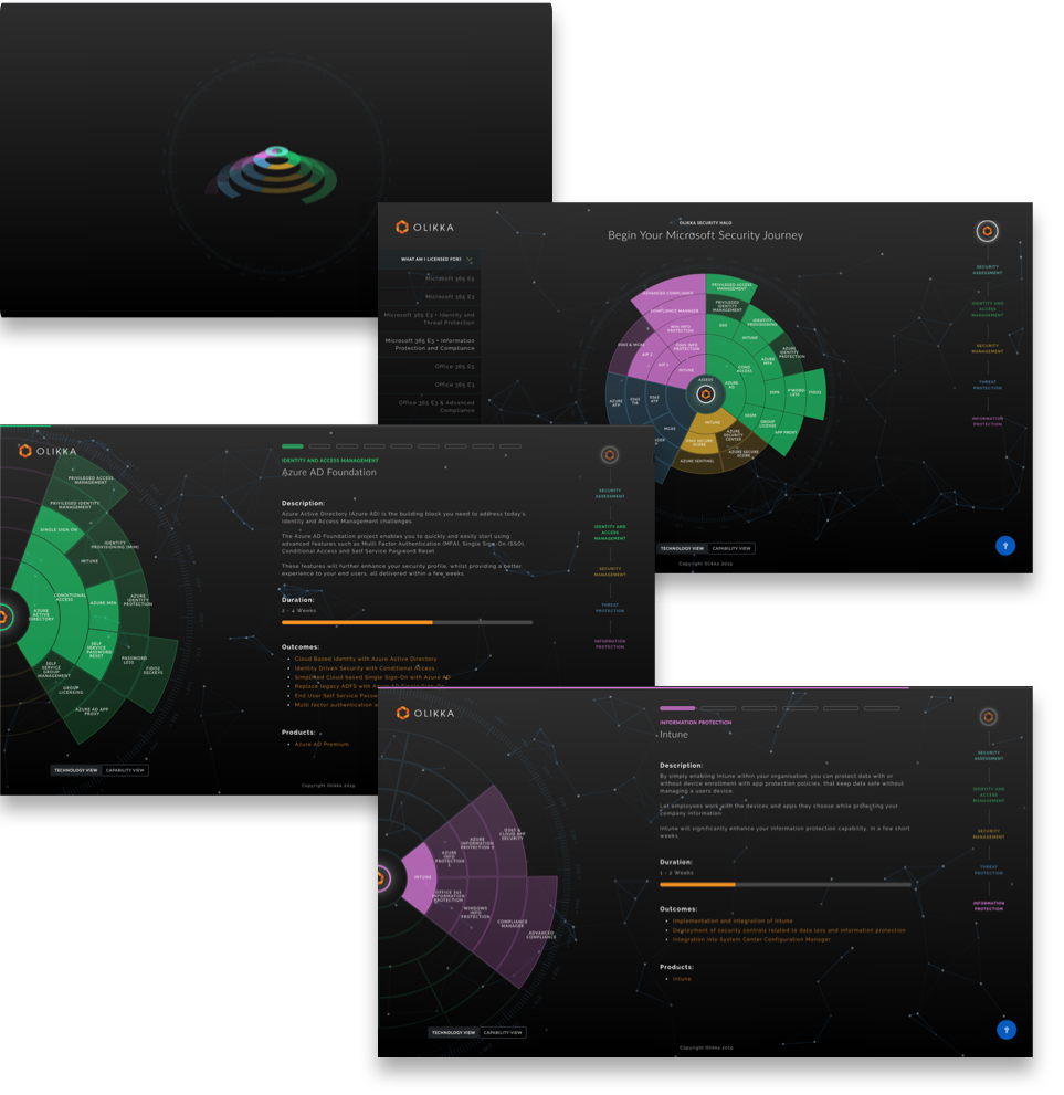
Melbourne, AustraliaWith a new security solution ready for market, Olikka needed a fresh, interactive approach to turn a complex landscape into an easy decision for prospective clients. Olikka had developed a simplified security offering for customers while still needing to demonstrate the multiple phases and streams to choose from.
Olikka turned to RialityCheck to design an accessible, interactive microsite to improve security decision-making, while also integrating a content management solution to make in-house updates easy.
While knowing the limitations of an existing platform, the end result was a custom-built solution using React and the flexibility of SVG for the graphical presentation. Providing guidance on site accessibility, interaction and overall design, we were able to provide an effective decision-making tool for Olikka's clients.
- UX Research & Design
- UI Design
- Application Development
'A.Mazing. Kudos indeed.' via Twitter
Designing for Decision Making
Step one was providing wireframes followed by high fidelity mockups. The build began with graphics designed in Illustrator and imported into React, allowing for targeted elements for any required interaction.
With a large amount of content to display, it was most important to make every phase and stream accessible and legible on all devices. We also needed to ensure the experience was seamless, to keep the user connected while exploring the content. This was achieved by navigating the users into the sub-levels of the site by zooming transitions and scrolling progress markers.
Not only did the resulting Security Halo microsite offer all information in a simple way, Olikka has been able to work alongside potential clients to browse and interact with their security solutions.
Designing for Decision Making
With a six-month timeframe to market, Angular was the front-end framework of choice. Providing many core features straight out of the box took away the need to spend R&D time on other solutions. Angular Material was the optimum choice, not only for its compatible UI component library, but the component selection was also robust, again reducing the time needed in the decision process.
By marrying a new backend framework with a modern frontend, the application now runs extremely fast, and splitting the front end into separate modules also helped improve performance; pieces of the application now load only when required.
We take in-app notifications for granted in most modern day applications, but this was something that was never a primary requirement. Though by adding in notifications we were able to hook into the event flow to add some subtle features that have improved the overall user experience. Working with a great backend and management team helped with the smooth roll-out and deployment of the new application, with positive reception from the existing users.